New faces on the block
Published 4:00 pm Monday, January 2, 2012
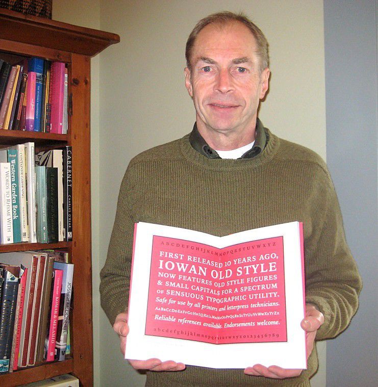
- <p>John Downer, a preeminent type designer, holds a sample of his typeface "Iowan Old Style" which has just been sublicensed by Apple for use on the iPad and iPhone.</p>
Bitstream Iowan Old Style is a hardy contemporary typeface with chancery italics.
The passing of Apple computers cofounder Steve Jobs at 56 was a blow to the techie world. Jobs was either a demon of perfection obnoxious, loud and narcissistic or a technological genius. Or both.
Nearly every major publication, right down to Rolling Stone, felt obliged to include a biographical sketch of him after his death from pancreatic cancer on Oct 5. My relationship with Jobs, albeit virtual, began at the beginning of the personal computer revolution.
In the early 80s, I was part of a small enclave of techies on the Big Island of Hawaii discovering the digital world. Tandy, selling through Radio Shack, had a small computer the TRS-80 which ran Volkswriter, a primitive but, at the time, revolutionary software for anyone interested in words on the page.
As a poet, I fell in love with it instantly. With a typewriter, the whole damn poem needed to be retyped before you could see its new look on the page. With Volkswriter, you could make a title bold, set margins, change spacing and print out the new version on the spot.
Fonts
In those early days, nobody was nitpicking about typefaces. There was no such thing as a pull-down menu offering Baskerville-Semibold, Chalkduster or Zapf Dingbats. We were just elated to have a machine to write with.
Despite being a six-finger picker, I could speed along on a keyboard and almost keep up with my thoughts (which is not to ignore that handwriting has its own rhythm and sensuousness). But even more than speed, the ability to move text, cut, paste, copy and revise was mind-boggling. I know this sounds simple-minded to those born after 1980, but such is history; we rarely understand whose shoulders we stand on.
Soon, though, Jobs who had briefly studied calligraphy at Reed College with Father Robert Palladino, a disciple of Oregon calligraphy master Lloyd Reynolds began taking us to the next level. He changed forever that clunky type flashing ignobly against a green screen.
In a 2005 Stanford graduation speech, Jobs said, Throughout the campus [at Reed] every poster, every label on every drawer, was beautifully hand-calligraphed I learned about serif and sans serif typefaces, about varying the amount of space between different letter combinations, about what makes great typography great.
When we were designing the first Macintosh computer, it all came back to me. And we designed it all into the Mac. It was the first computer with beautiful typography. If I had never dropped in on that single course in college, the Mac would have never had multiple typefaces or proportionally spaced fonts. And since Windows just copied the Mac, its likely that no personal computer would have them.
The Business of Typefaces
Fast-forward and not only do we take computers and computer fonts for granted, few of us know much about the art of creating a typeface. What does that even mean? you might ask, Letters are letters, arent they?
Not hardly.
John Downer, of the Jacks Country Store Downers, has spent his life in the world of calligraphy, typography, fonts and typefaces. His interest in letterforms began at a young age at school in Tacoma. He started his apprenticeship as a sign painter in 1969 in Longview, and in 1983 began his career as a freelance type designer.
John has since designed numerous typefaces, including type designs published by the Font Bureau, Bitstream, Emigre, Design Lab and House Industries. My most famous fonts are probably Iowan Old Style, Brothers, Roxy and Vendetta, he says.
His keen eye was most likely developed in sign painting. During the holidays or in the summer when John comes to check in on mother Lucille, his handiwork can still be seen at Jacks. Originally my interest was in hand lettering from the Speedball text book, but then I became more interested in lettering with a brush, he says.
His recent coup is that Apple has licensed Iowan Old Style for iBooks, which operates on the iPad and iPhone. I got a nice royalty check in the mail about a hundred times the normal and then I found out what was going on, he said sipping coffee in Adelaides Books in Ocean Park.
Now Im hoping they will also take a look at my typeface family called Paperback.
Digital Paperbacks
As those of us who love turning pages lament the demise of the book, e-Books sales (now noted in the New York Times Book Review) continue to soar. One of the purported advantages of e-Readers like the Nook and the Kindle is that analog readers (AKA: humans) can select their preferred typeface and size. Hence, there is a resurgence of focus on how the virtual page looks.
House Industries, a font foundry that has set out to rescue distressed digital alphabets, contracted with John to create Paperback for digital publishing. They note, Mr. Downer is a renowned craftsman, celebrated scholar and a distinguished gentleman his qualifications are impeccable.
Back to the Foundry
Talking to John is like taking a stroll back in time. We tend to think if we think about it at all that typeface and font are synonymous. No again.
A font is a component in a typeface family. A font is one character set that includes roman, italic, bold, or bold italic in that order, says John. Every font in a typeface family can be scaled from 6 point to 120 point and beyond. But the term font didnt come into being until type was being founded. A point is 1/72 of an inch.
Way-back-when, a type foundry actually made letters of wood or metal. In the early years of typefounding in England, these letters were called founts, with the u in place. Setting type actually meant grabbing the appropriate letters and locking them together backwards into a block that would be inked and pressed against paper. (Ps and qs are easy to mistake for one another when backwards; hence, the root of the expression to mind them.)
Now a type foundry designs and distributes typefaces for digital application. So, John designs typefaces, made up of fonts; he licenses them to type/font foundries (like House Industries and the others mentioned); and they sublicense typefaces to original equipment manufacturers like Apple.
When Apple put Font in the now-omnipresent pull-down menu, they perpetrated a misconception. People began to think that a font was a style of type, says John, and that did a lot of damage thats irreversible. Well, its a fine point, but now we know.
And if you want the inside scoop on serifs and sans serifs; why Roxy (one of Johns typefaces) is used for off-brand pharmaceuticals; stories about Trajan (created by Carol Twombly when she was at Adobe) for movie advertising; and Johns four friends who were named MacArthur genius Fellows, ask him while hes in town.