Coast Chronicles: Have brush, will travel
Published 9:19 am Wednesday, October 19, 2016
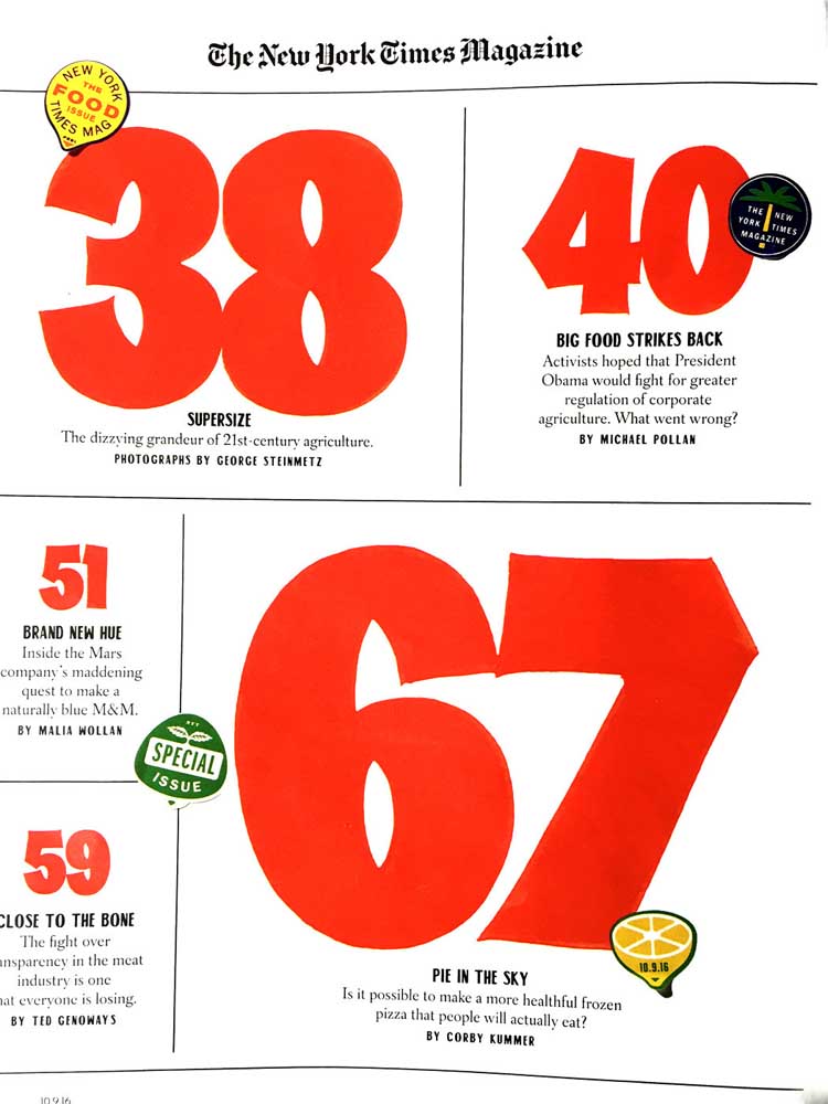
- The hand lettering work of John Downer, journeyman sign painter, is featured in the cover story in last weekend's New York Times magazine.
As an inveterate media hog, one who drives every Monday to the Blue Scorcher in Astoria to pick up the Sunday New York Times, imagine my thrill seeing the name “John Downer” on the contributor’s page of the magazine (always my first read).
John had texted me the week before to let me know his hand-lettered illustrations would be appearing in these prominent pages, so my anticipation was heightened. I have to say, it’s the classic “home-town boy makes good.” Though, of course, John, scion of Jack Downer of Jack’s Country Store fame, has been making good for many decades or he would never have received the call from the New York Times design team.
But let’s back up a bit. I’ve written about John in the past. His interest in letter forms began at a young age at school in Tacoma. He started an apprenticeship as a sign painter in 1969 in Longview, and in 1983 began his career as a freelance type designer. He lives in the world of calligraphy, typography, fonts and typefaces; but his special niche is hand lettering. Many don’t notice this, but whenever John is home — he now lives in Iowa — he works on hand painted signs for Jack’s and other local customers. Many of the signs in the grocery and hardware sections are his.
“I’m a sign painter,” he says, “I make ephemeral paper signs for grocery specials — and this has made me sort of a household name in my profession. That’s become my niche, which is fair enough. It’s the one branch of the sign trade that I’ve had practice in since I was a teenager.”
“But hand lettering is only a little corner of my area of expertise,” he continues. “I get pigeon-holed.” John has also designed fonts which is a whole separate thing.
Let’s get a couple things clear. Computers have made most of us aware that letters on the page can look different. Steve Jobs studied calligraphy at Reed with Robert Palladino and, even in the early days of the Mac, Jobs wanted the typography to be graceful. Thus, with a swipe of your hand you can change a digital typeface from Garamond to Times New Roman. But there wasn’t always a pull down menu for such things. These fonts are created from pixels, as opposed to the old-fashioned method of printing. Type was forged from metal in a foundry, set in metal trays called composing sticks upside down and backwards, then inked for pressing onto paper. (Our language has retained these words of the trade: “font,” “press” and “type setting” among others.)
Anyway, John has designed numerous typefaces, including type designs published by the Font Bureau, Bitstream, Emigre, Design Lab and House Industries. “My most famous fonts are probably Iowan Old Style, Brothers, Roxy and Vendetta.” But John started with a Speedball text on his desk, not a computer, and ultimately became more interested in lettering with a brush.
So when the NYT was putting together a magazine cover story that would ultimately become “Big Food” — they emailed John to ask for help.
The trouble was, first, they had a six-day deadline for the finished product; and, second, John was actually on the road far from his studio and workshop in Iowa. But you don’t say no to the New York Times! “It’s always gratifying to get a call. So I had to find a way to make this work.”
John had driven from Iowa to visit the Peninsula and also give a workshop in Seattle. So he had most of his basic tool set with him. And, on his way back across the country, he had decided to visit places that he knew had “some good old wall signs from past ages.”
“I got the email when I was in Klamath Falls, you know that remote old logging town. I was researching signs. I spent an afternoon just walking around town taking pictures. Then when I checked my email on my phone, I had this request from the New York Times. They said, ‘we have an adequate budget but a tight timeline.’ They’d already decided I was the right man for the job.”
“The problem was it was going to be days before I got home to my studio, so I had to figure a way to work on the road. It’s amazing that today with a suite of technologies — a digital camera, thumb drive, laptop computer, a cell phone and enough dry space — you really can work remotely. I used public libraries for their wi-fi, their photocopiers, and then printed from my flash drive. As long as I had enough desk and table space that I could set up a makeshift studio I was fine.”
“So I worked in hotel rooms,” he continued. “I always asked when I checked in for an east facing room, not for sleeping reasons but to get the morning light. If there is sun is streaming in through the window, I can position a finished art board so that I have the highest contrast.”
John hand lettered an array of page numbers and phrases for NYT Magazine headlines, drawing on his years of painting experience at Jack’s Country Store. “I have grocery styles that I’ve used and refined since 1969, over 45 years. The page numbers were based on price numerals that I often use for Jack’s banners.”
The Times was interested in being sure readers recognized that John’s designs were hand-made, so even in the numbers 30 and 34, 51 and 59, the threes and the fives are different. As John said, “They wanted these subtle variations.”
Usually after he hand paints a number or word in black, he can retouch the letters using white for sharper edge definition. After photographing the painted lettering, these are transferred digitally to his laptop. Generally he likes the size of the original to be about twice the intended reproduction size (although there is one page number, 67, that is very close to full-size). This usually brings his work into sharper focus.
The van John drives belonged to his parents, Jack and Lucille — it’s a Chrysler Voyager with plenty of life left in it. When the Downer boys encouraged Lucille to give up driving a few years before she died, I guess John must have won the flip. He’s taken the seats out and, with an air mattress thrown in the back, he can wander the blue highways of the nation researching old signs — that is when he’s not working in his Iowa studio. “I can pull over and get a little snooze after lunch then get back on the road.”
He’s also got things figured out about where it’s safe to pull over for the night. I won’t share his private list of finds with you but our conversation made me smile. John has created his own niche in the rarefied world of type design. And, at the same time, in my humble opinion, he’s at the top of his form. Designing lettering for New York Times cover story while wandering the byways of America really is “Have Brush, Will Travel.”


